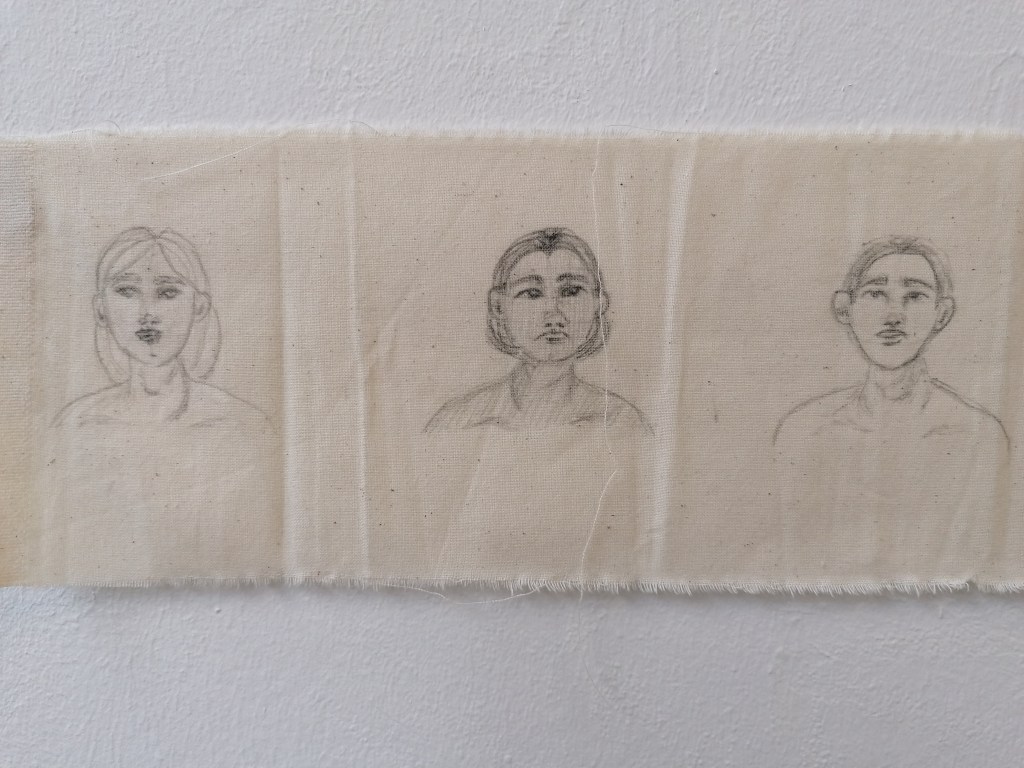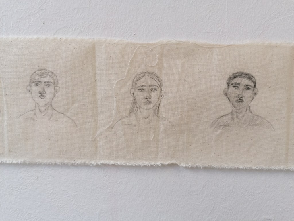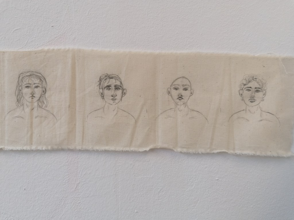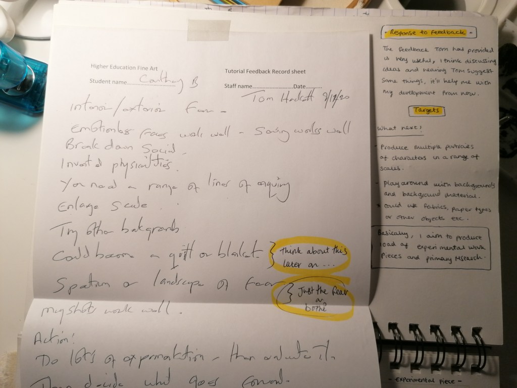
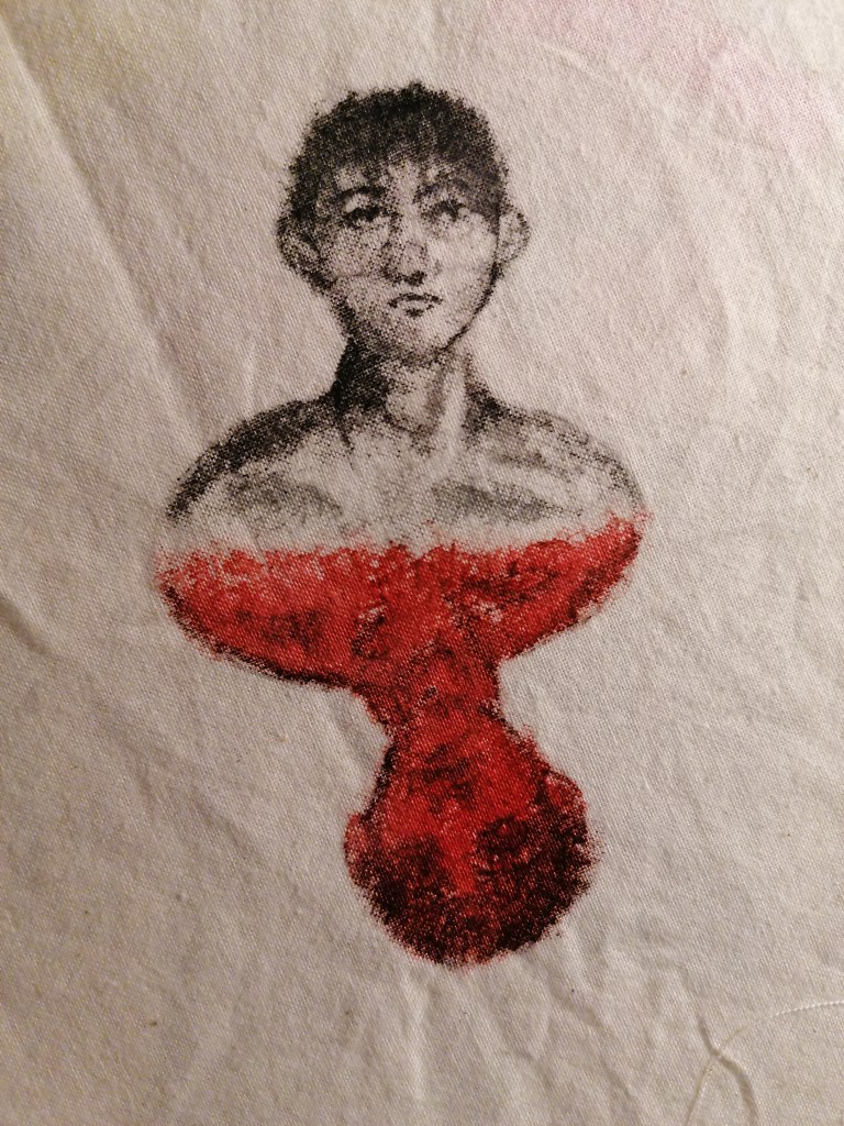
experimenting with different coloured paints & styles

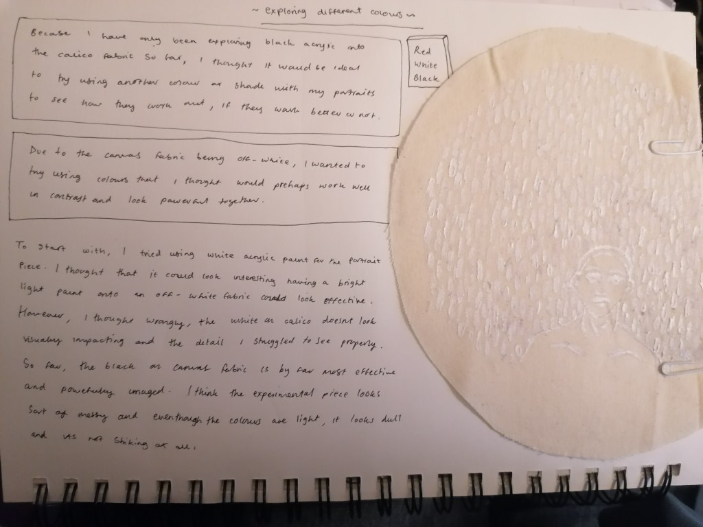
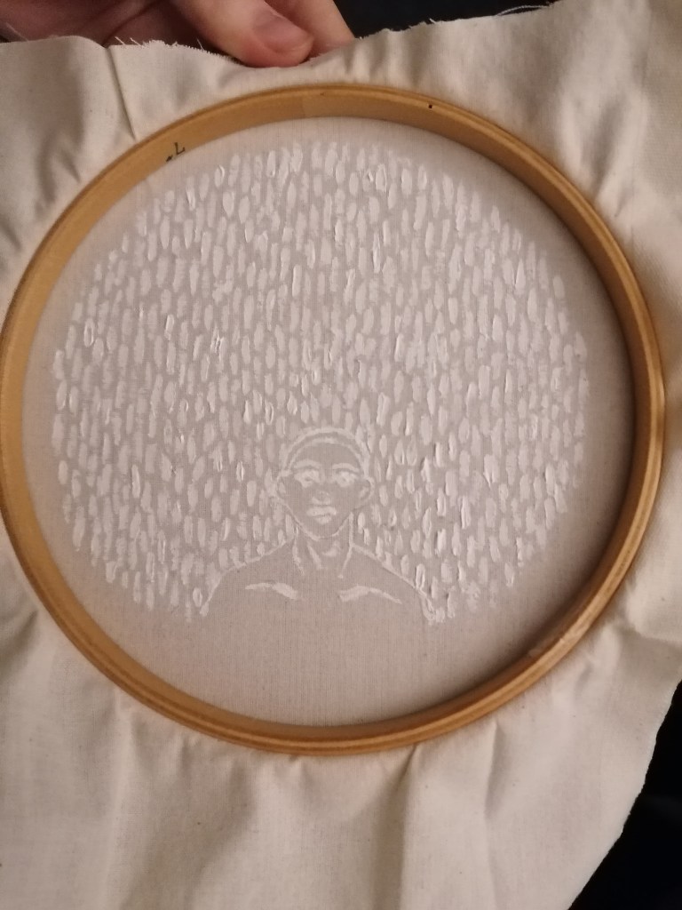
WHITE
(against light-shadowing effect) painted in my original style
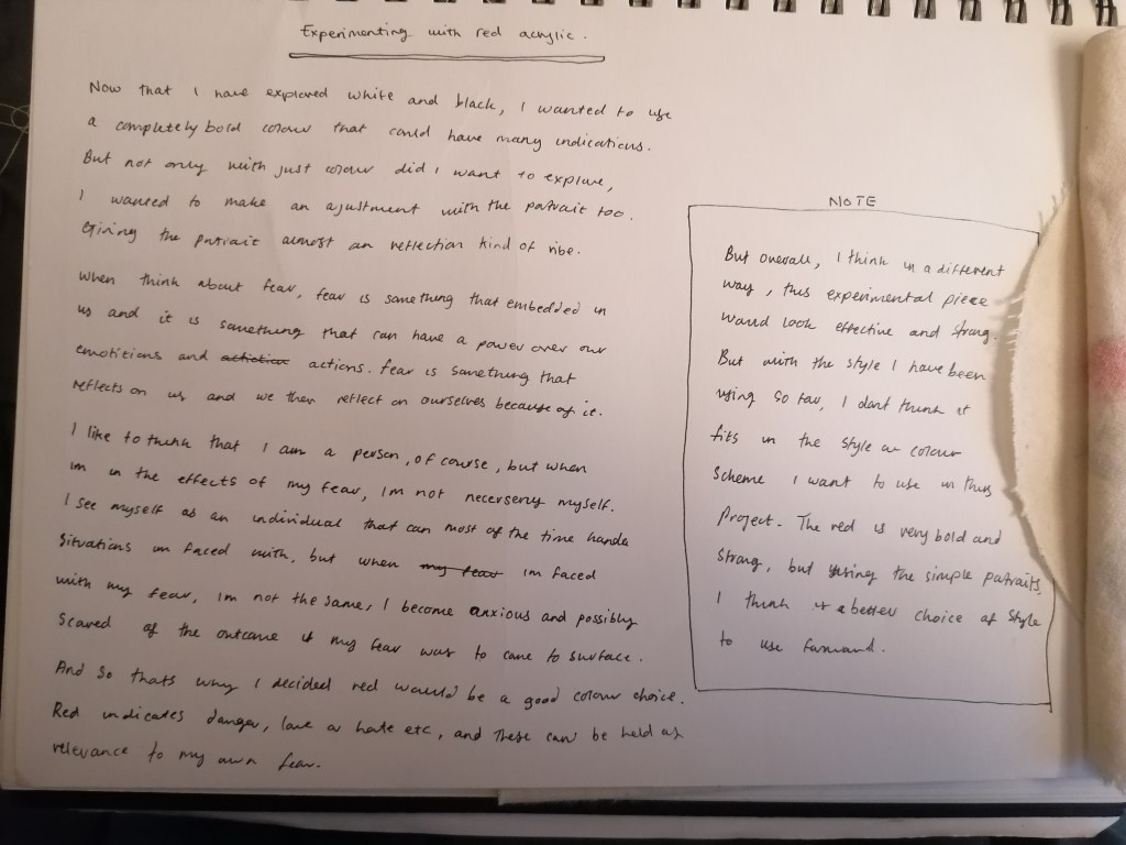
RED

With this portrait, I tried something completely different to what I have been doing so far. What I was trying to interpret in this piece was kind of like a fear version of ourselves? So I made the portraits reflect themselves and painted the in more realistic tones by adding the shading areas and darker tones in places.

I chose red for experimenting with colour because red has many interpretations. For example, danger, love, blood and anger etc. So I figured it would be a good colour to use for this experimental piece. However, I think that the red is again distracting and too bold. I want to try and be subtle in my portraits and I think that if I were to use a statemented colour such as red, people might think the piece is based on something else from the theme I’m trying to lead by.

The portrait alone reminds me of playing card though. And I think that this style would be a good demonstration if I were to do a mini separate project where I would be working with playing cards.
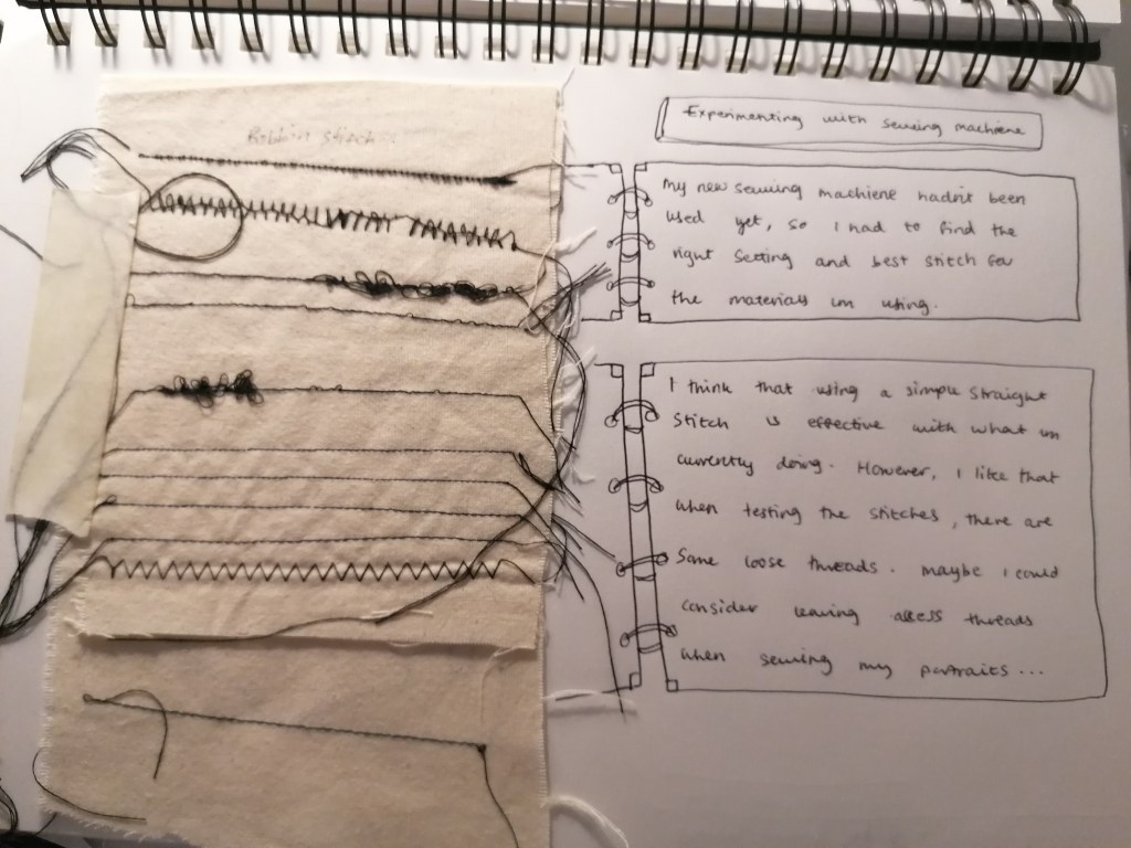
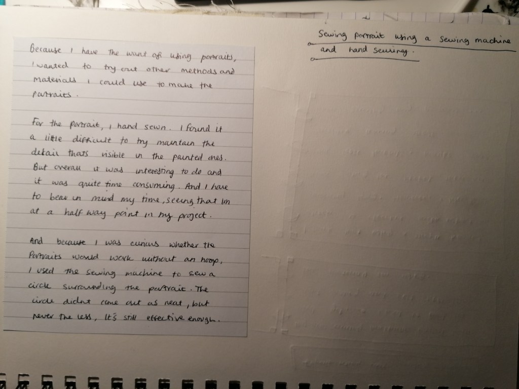
Experimenting with sewing machine & hand sewing portrait

I felt that it would be suitable to practice and explore with using my sewing skills and sewing machine for this project because it involves the use of fabric materials. I was looking forward to playing around with the idea of sewing again and this time have something to help speed up the process of things.

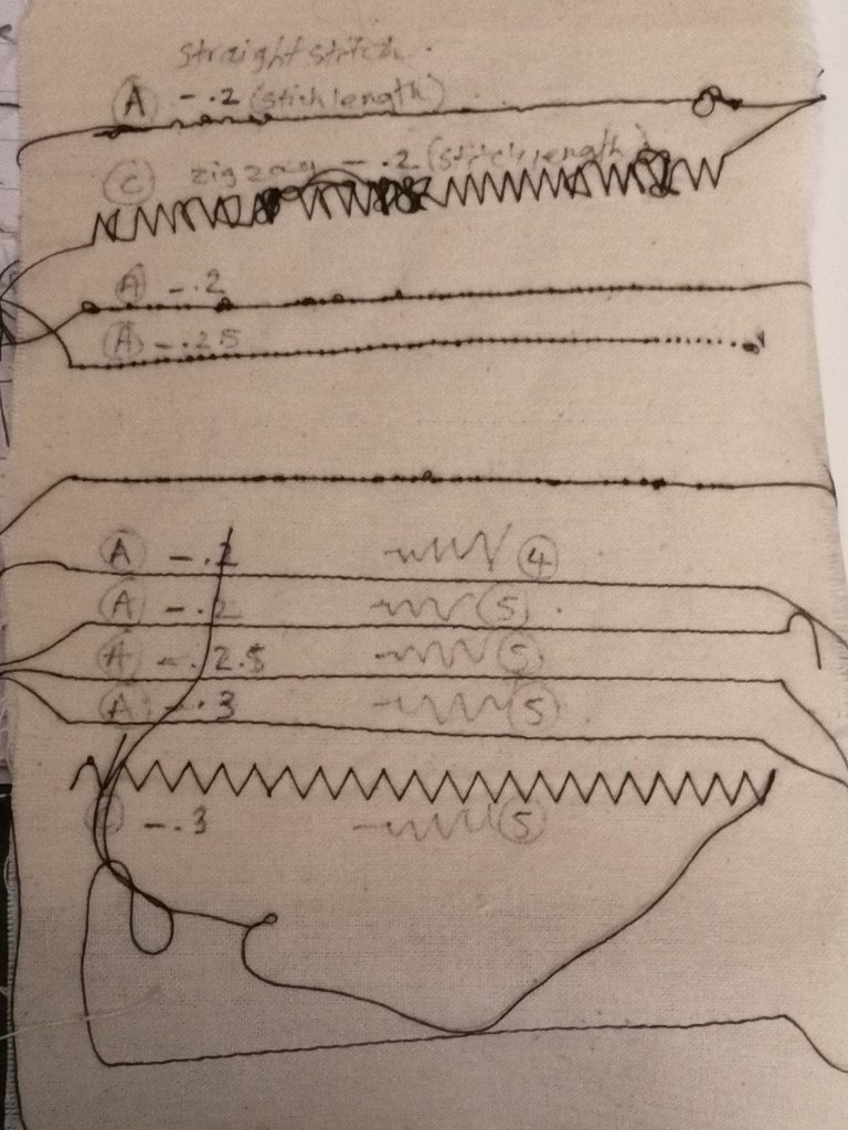
noted stitch patterns and lengths settings~

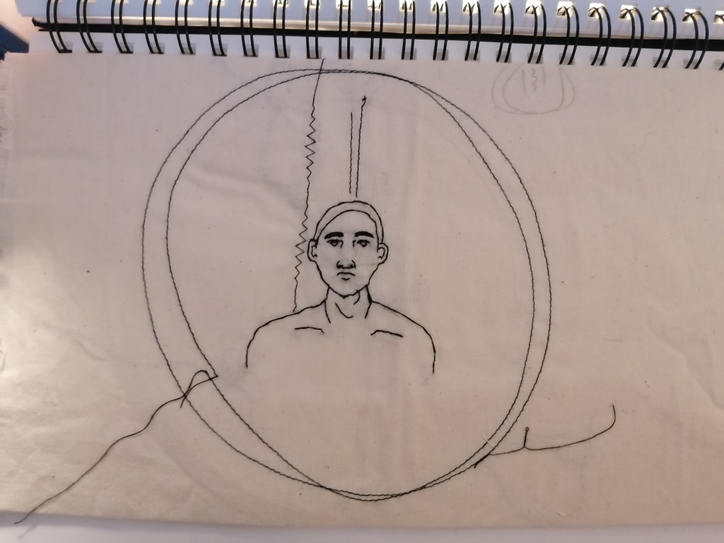
I ended up deciding that setting the machine onto a simple straight stitch (A) with the the length on setting (3) and the stretch at (5). At this setting, the stitch didnt get caught up and pull onto the calico because of the fabrics texture.

Hand sewn portrait and machine sewn surrounding

I think that with this method of making the portrait isn’t going to be the best process of doing things in terms of development. Sewing the portraits by hand is very time consuming and I personally prefer the painted portraits in terms of presentation. For some reason, using the stitch and thread in all the same places I would with paint and a brush, it’s still starved of detail somehow. But overall, I’m glad that i experimented with this method, but I’m uncertain whether it’s a method and process I’ll be using towards my final outcome.

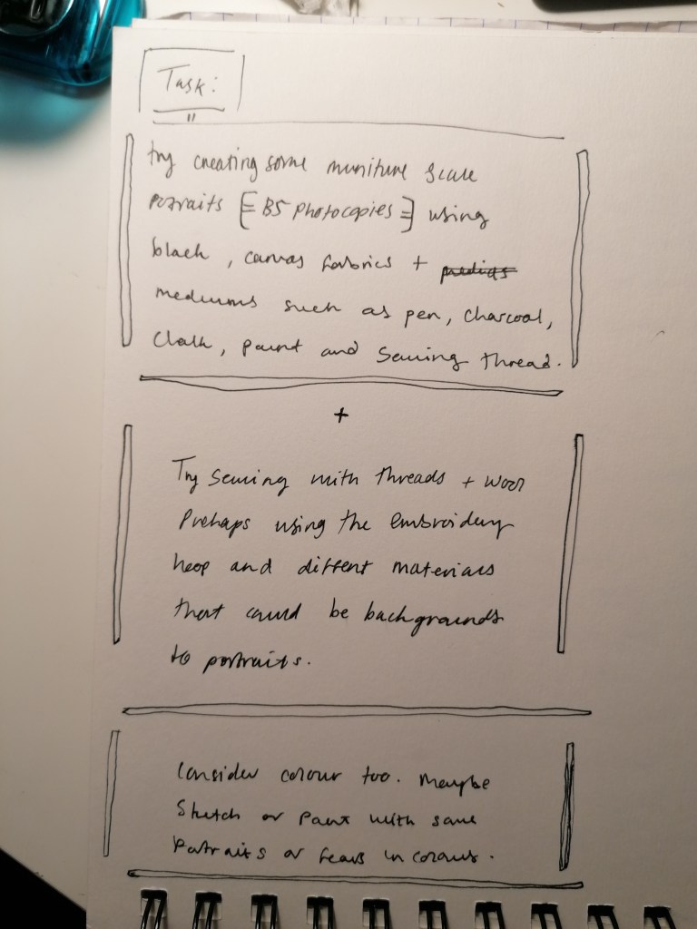
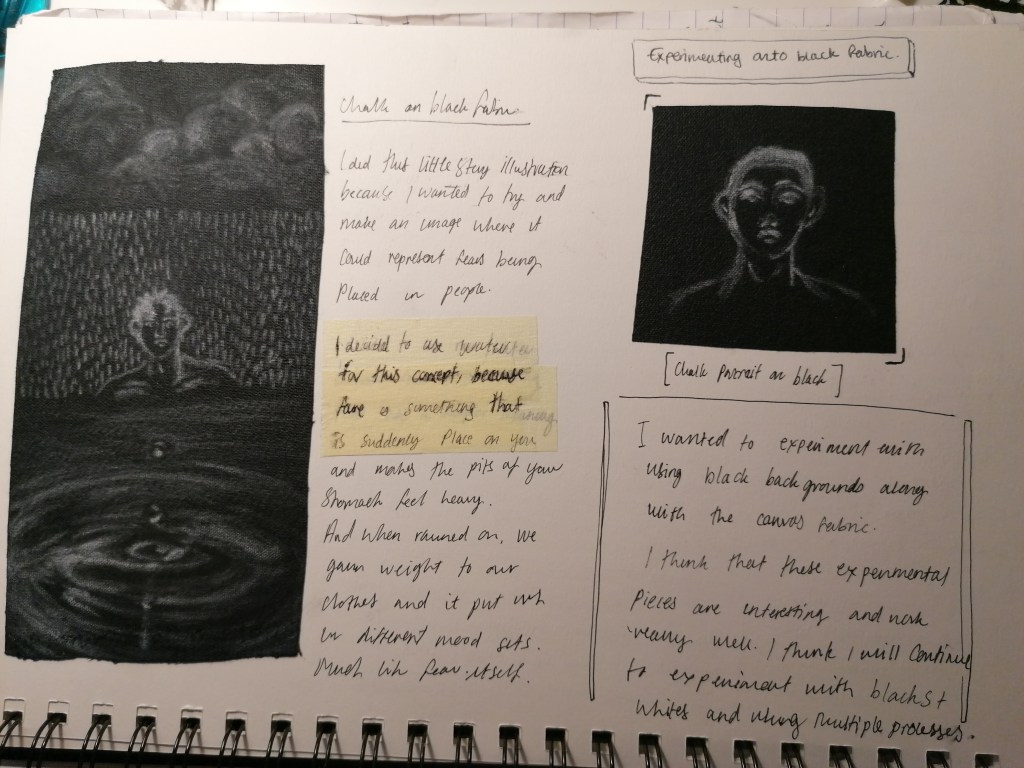
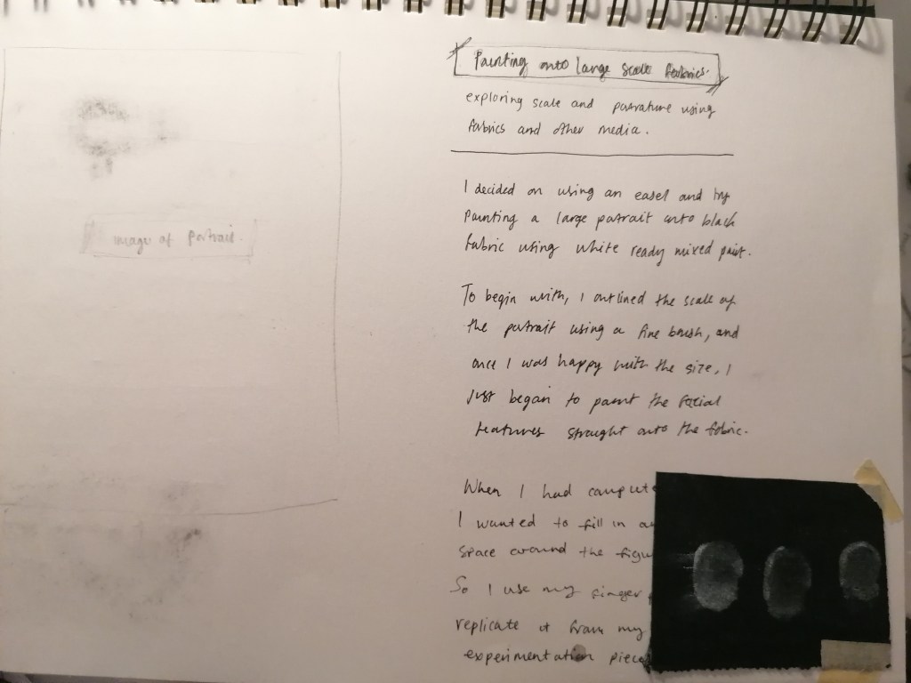
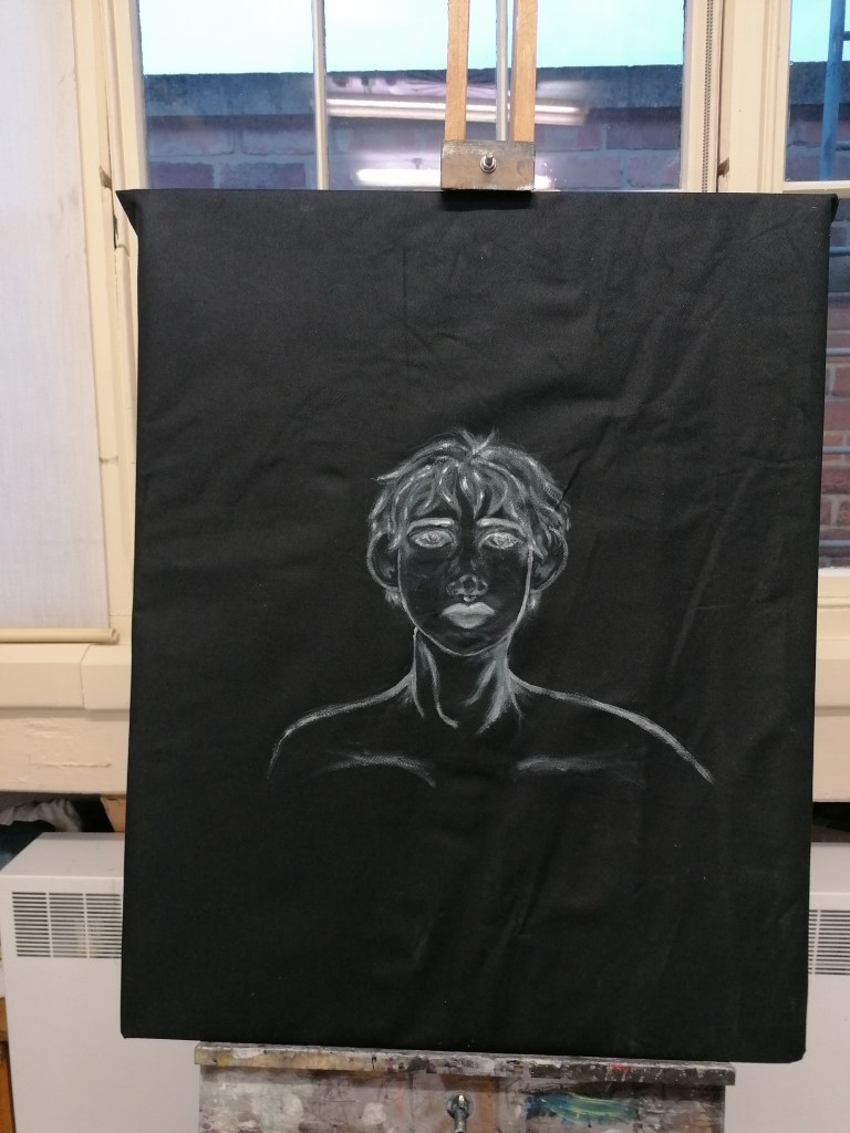
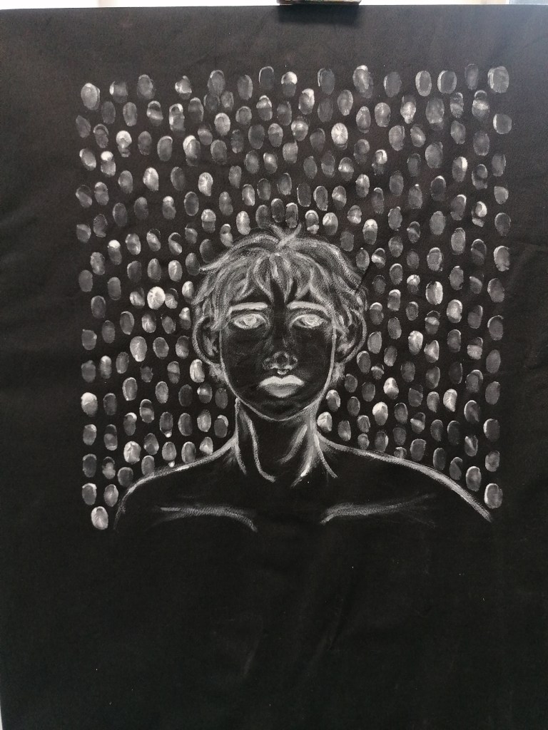
Experimenting onto black fabric

(Embroidery hoop scale 7″)

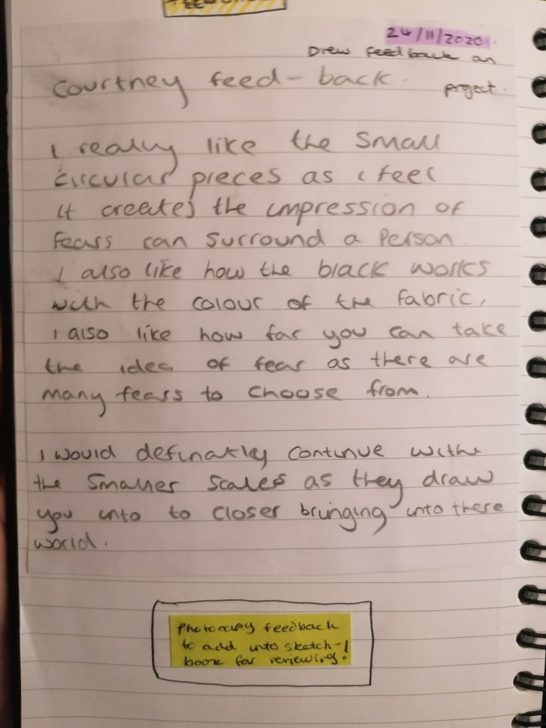
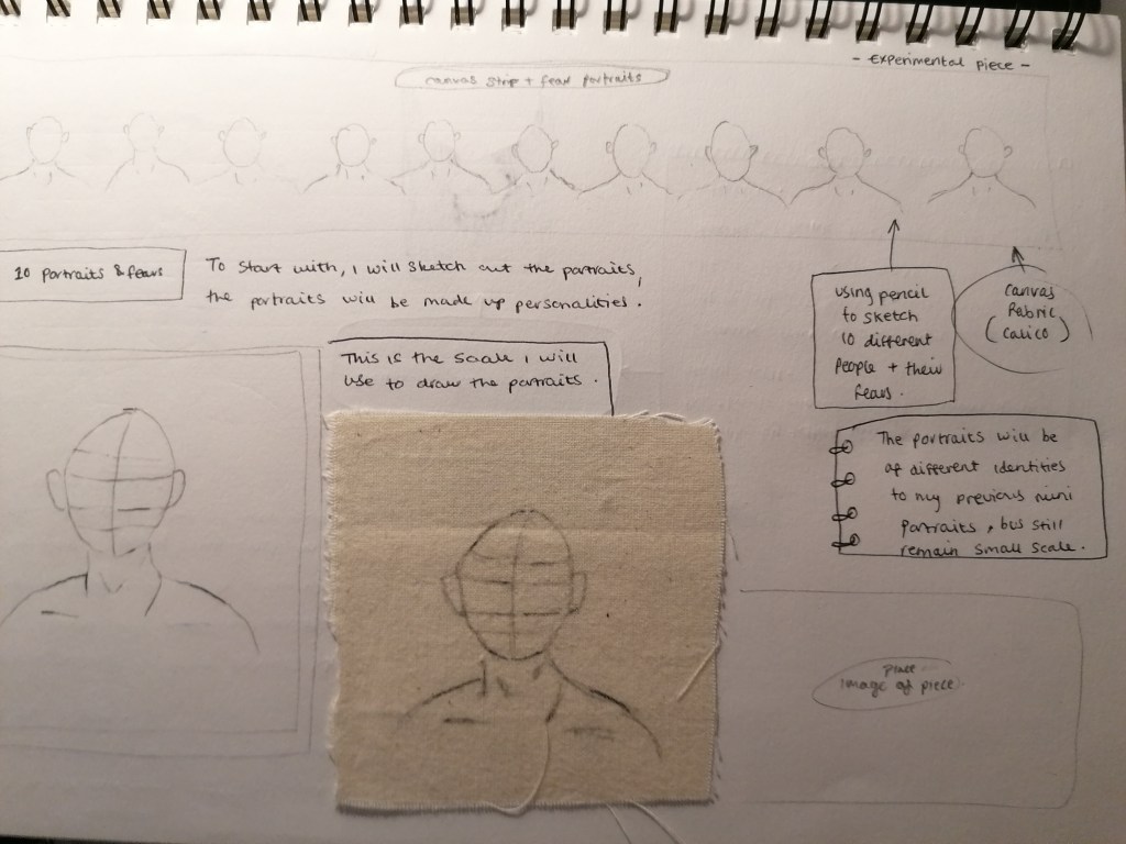
I think that working with the embroidery hoop scale is more to my liking, I think that because it’s not necessarily a big scale, the detail can be kept to a minimal and still look effective without having to worry about over-doing it with unnecessary details that could possibly ruin the outcome.

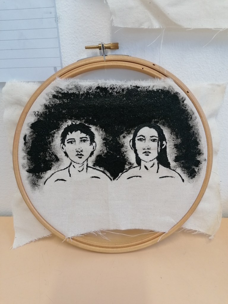
Using my finger prints to replicate the brush markings on the smaller scale portraits. I wanted to see it the image could look as impactive as the others, and that a finger print gives the work a more personal touch, an ownership if you will and that then refers back to the idea of ones fear.

I’m not really happy with the overall outcome with this portrait, It is much larger than the hoop scale. But I also think that these paintings are like inverted black and white photographs which are also considered to be bold styles and colours, but the style doesn’t fit with the theme of fear I’m going by.

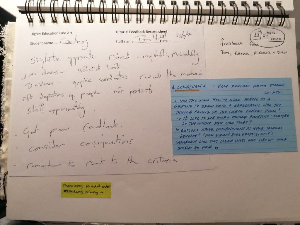
I also found myself having to add extra details in places such as the face for toning and shading because the white outline didn’t look as effective as I was expecting it to be. So I think that I will be sticking to use calico towards my final, because it’s gave me the best results and my peers seemed to find the material more effective with the black acrylic.

backgrounds

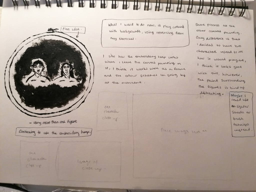
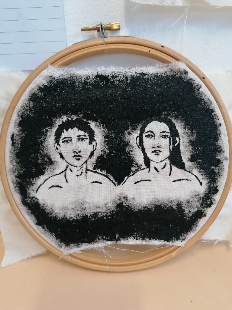
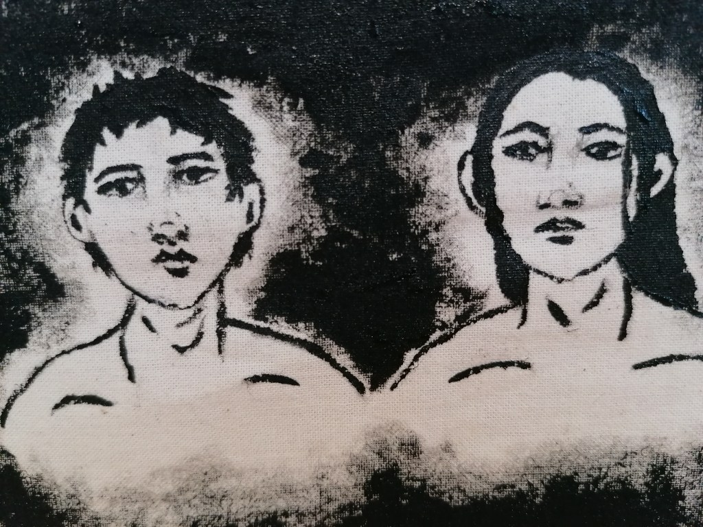
Because I have been using the calico fabric as it is with black acrylic, I decided to experiment with what the portraits would look like in a black surround imitating the fear of the dark or nothingness.

However, I feel like the surrounding black is too distracting for the portraits to look effective and/or impactive. It extracts the detail away from the portrait and seems like too much. However, I would think it’s a good idea to try experiment straight onto black fabric, using white paint instead.

I would also say that making sure about the size of the fabric matters too, because it’s not neatly presented as I would have liked it to be.

fabric(s)

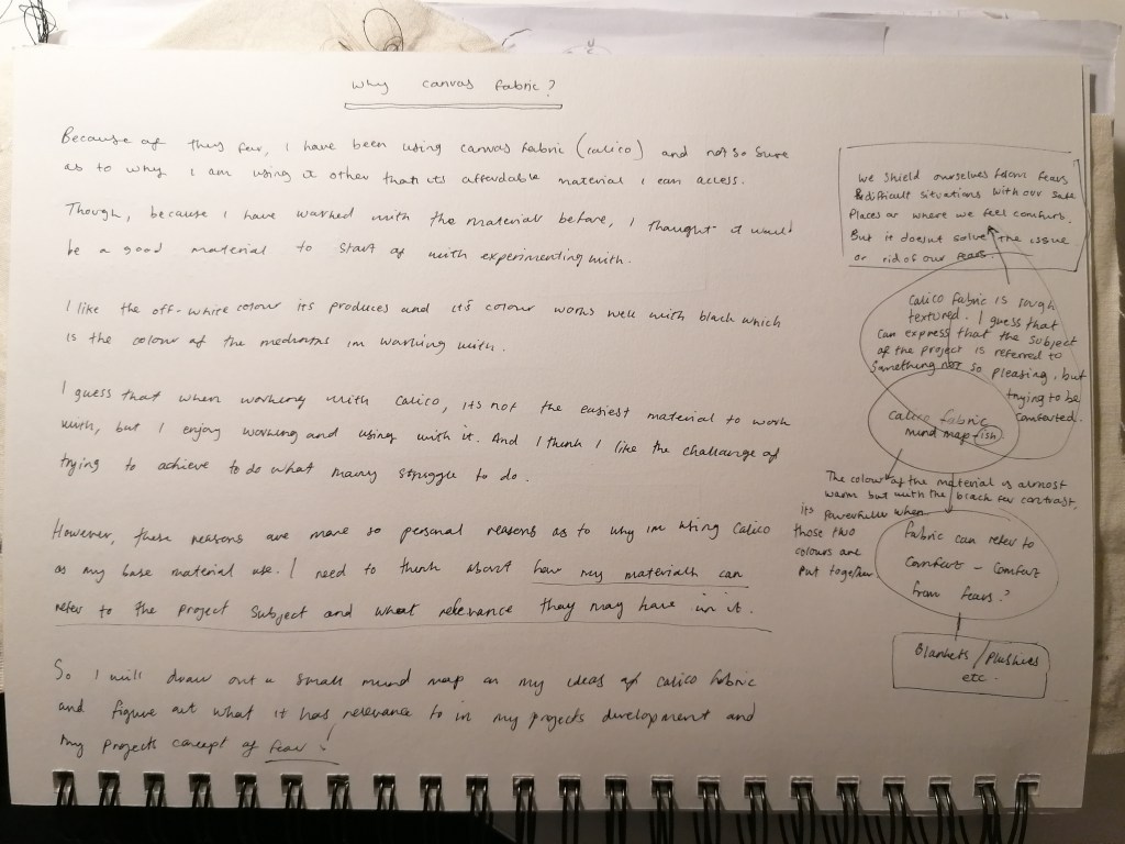
why calico/canvas fabric?

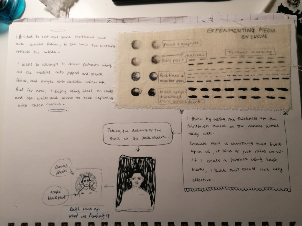
I think that deciding which fabric to choose to experiment with is important and what’s it’s relevance or associations are with the theme.

I’ve decided that for now on a more personal reason, calico fabric is accessible and affordable for the time being. But also, when I’m thinking about fear and what we do or use to escape it, almost child like, we resort to something that comforts us, and so taking the idea of a comfort object to shield us almost from our fears. In this case, a blanket, cushion or teddy etc. And so that’s why I wanted to use fabric to begin with.

However, calico fabric isn’t the most comfortable of all fabrics that I could choose from. But in a sense, that works in my favour. I’m using calico because of it’s qualities and not only because of it’s value. No matter how soft the fabric is, it wont rid the fear off completely, it’s only used as a comfort mechanism, and knowing that, doesn’t make the comfort object completely comforting.

In another sense, calico is a material used to cover over with other material or mediums such as gesso and paint, so having the fabric in its raw form and off-white colour gives the work what I like to thinks as a reality in a sense. And fear exposes a reality of sorts to us that we would like to avoid from facing and being exposed to. The pieces I’ve created so far with the fabric are not for it to only look pretty and visually pleasing itself, but to also help us recognise a reality of ourselves and be able to reflect.

My last reason would be that even though the portrait I’ve made seems aesthetic, using aesthetics is another way for people to be able to hide away, or express themselves. So the work I have produced might get several different views on the possibility of what it stands for or what it’s message is trying to get across.

embroidery hoop and canvas painting

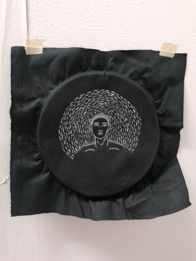
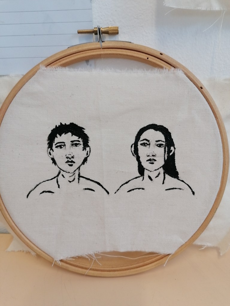
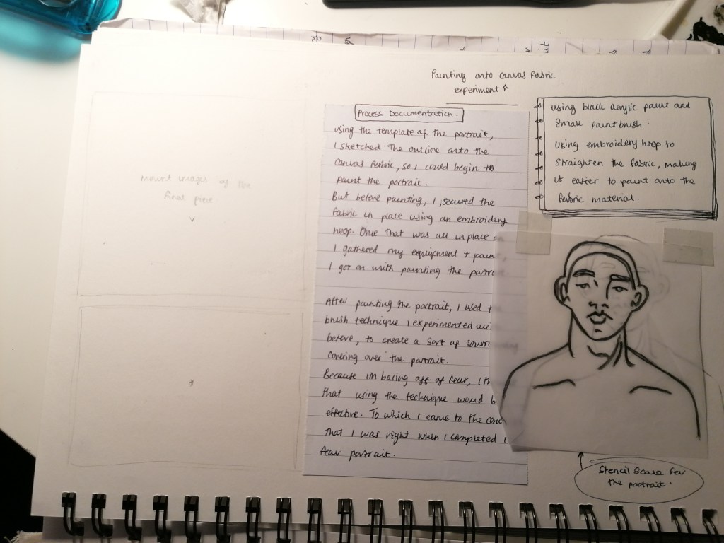
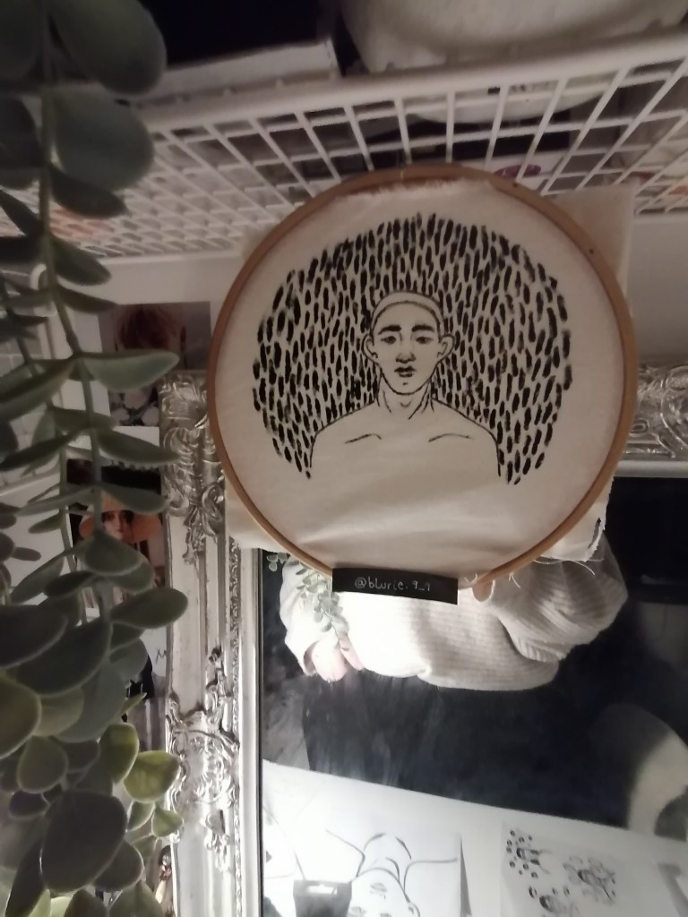
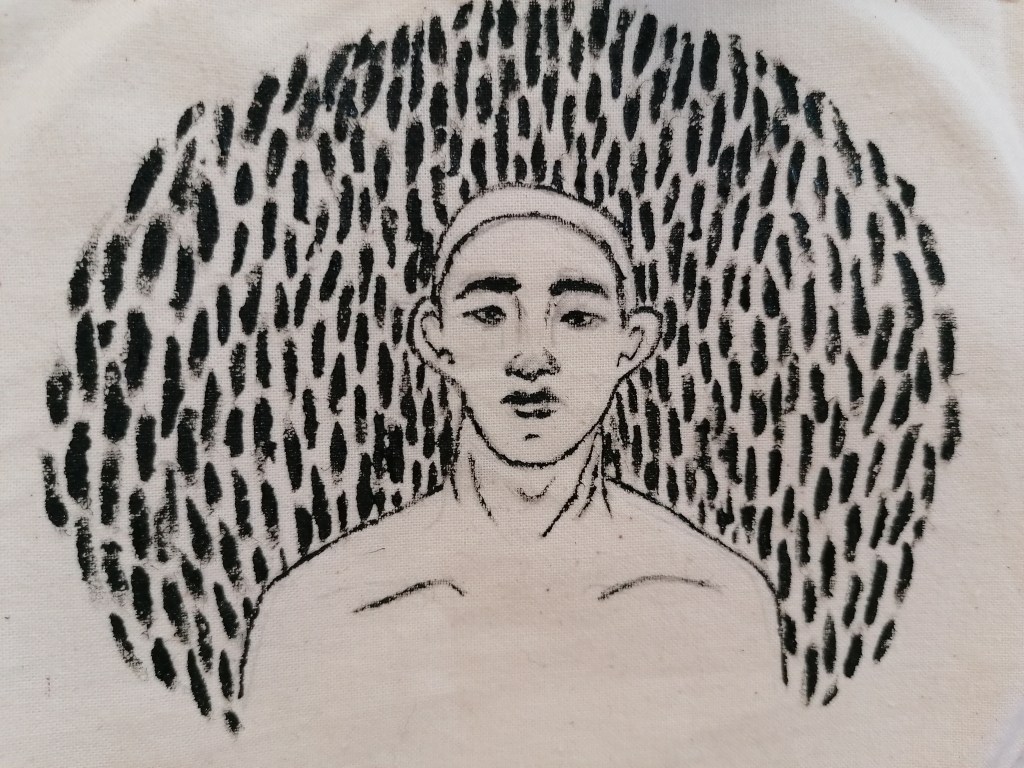
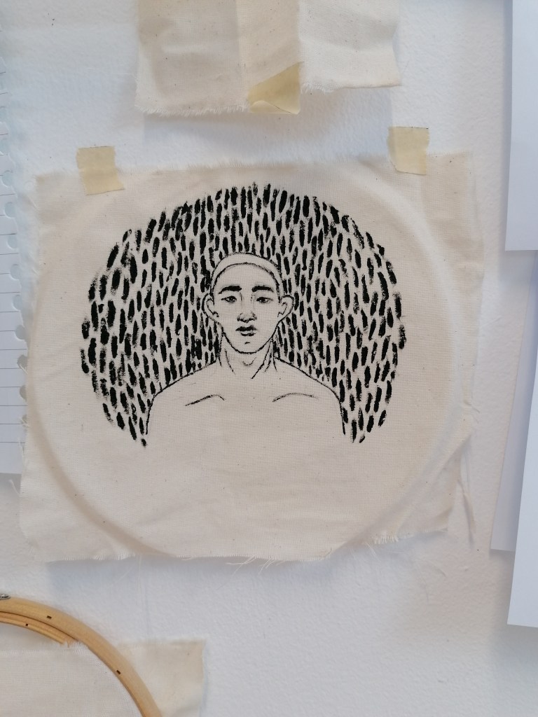
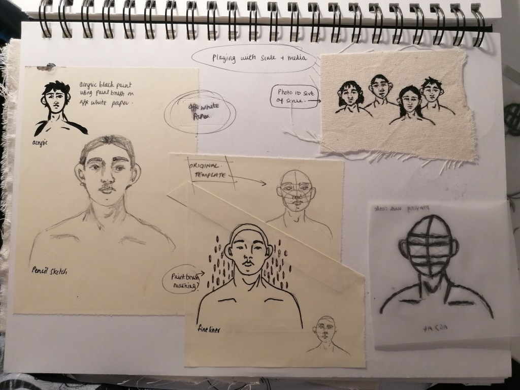
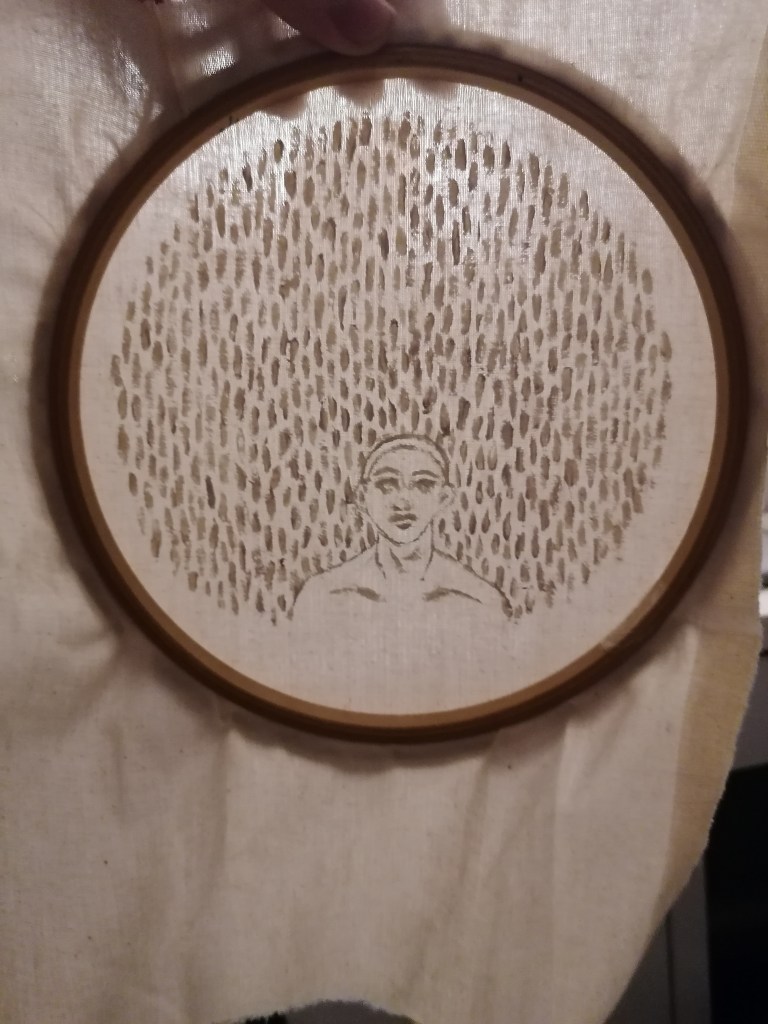
I used the embroidery hoop to begin with, to make the process of applying the black acrylic paint easier and less messy. I actually really liked how the piece came out in the end, it’s a simple style yet really detailed. To begin with, painting straight onto the canvas fabric was difficult, because the paint is thick in consistency, so I applied some water to the paint for a smoother line image and the paint prevented from clumping together by doing that.

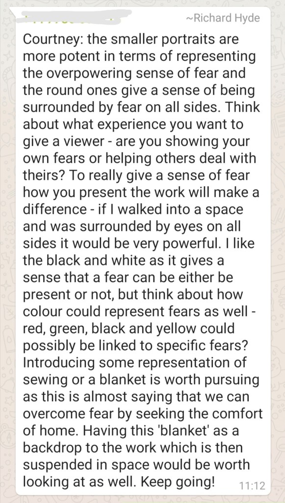
I think that keeping the image in the embroidery hoop would have been the best option, because it just emphasises the idea of surrounding and that concept fit really well within fear. If I had access or could afford more hoops, I would have liked to see what the portraits would look like if they were aligned on a wall or something.

Because of curiosity, I decided to fill in the surrounding area of the portrait with brush marks, to try replicate the fear I guess. When looking at how fear is could feel like, personally I thought the circular shape works and especially with the positioning of how I applied the brush marks. I think that fear is a very powerful thing and is hard to overcome or get to grips with, especially because everyone handles and reacts to their fears differently, even if it is the same fear, it’s more of how it effects us and our reactions to it that determines it’s power over/on us as individuals.

Overall, I’m pleased with the making process and outcome of this development work, and will consider to push further with what’s working here. I think it will be Interesting to see where this leads to in the project.