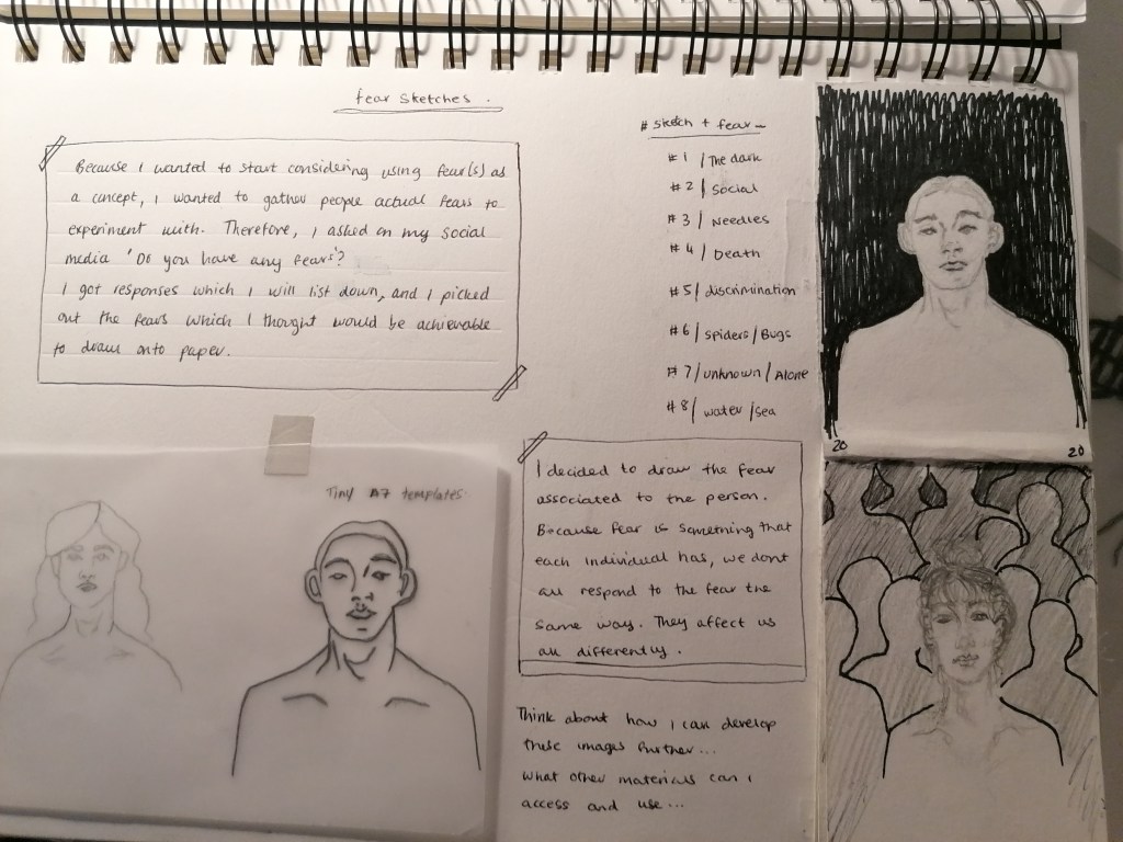
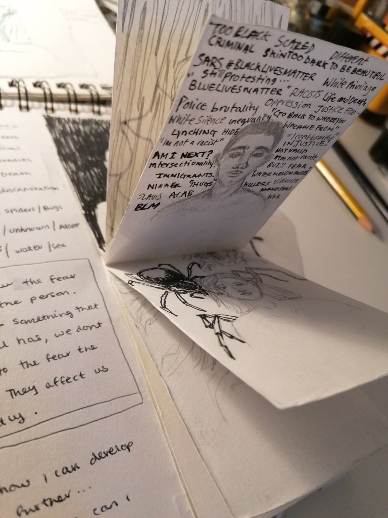
flip-book of figurative characters and their assorted fears
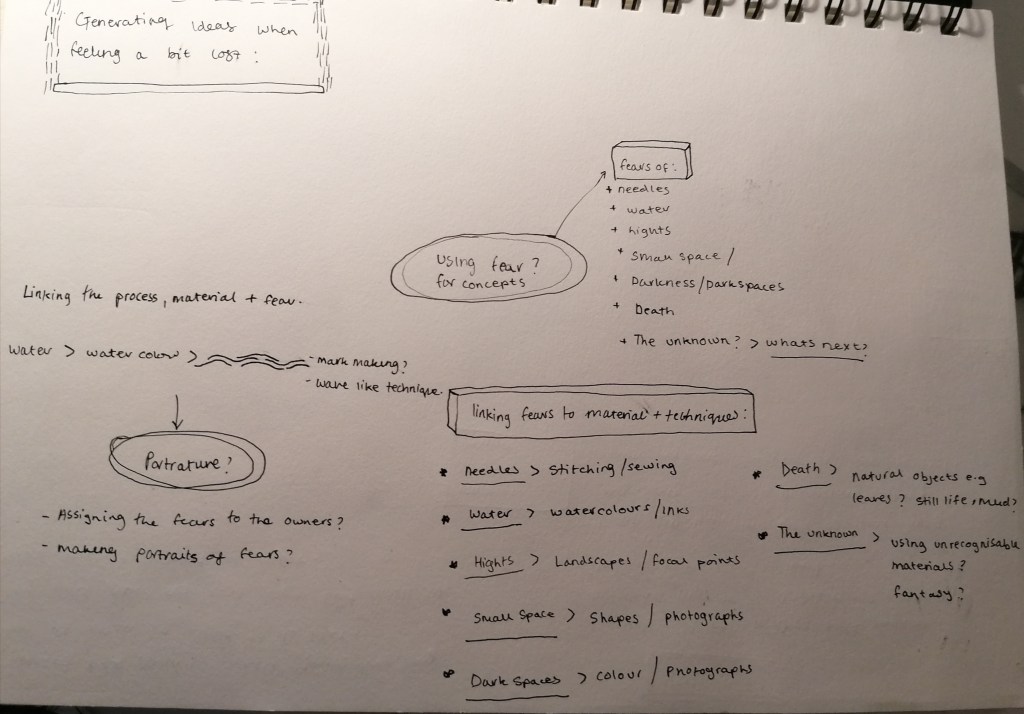
The fears are based off of real peoples fears, but the portraits themselves are all drawn from my own imagination. When i thought about fear and what types of fear there are, the list is endless. Fear ranges in different ways between each individual, and mostly likely everyone has a fear. Whether it be personally or subjectively. These fears could include, the fear of spiders, the fear of being discriminated and the fear for someone else’s sake.
And I believe that if I were to try draw these out, I wouldn’t be able to visually project that without the help and deep descriptions from the people they affect. So to keep things simple, I chose out some fears that people told me were their, that I thought I could draw out in a simplistic style that still captures some sort of emotional impact and contains enough detail.
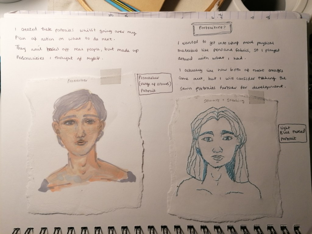
Because of my difficulty of coping and going off with what I was doing before in the project, I didn’t want to completely rid of all that I’ve done so far. So I have thought over what it is that I might possibly want to do next, and so using the idea of something ‘physical’ i.e. a body or person etc, I made some mini portraits using different mediums and processes that I might have used beforehand so I could try and fill up my sketchbook with experimentation and exploring, keeping to my project proposal but in a way were I can try and make connections to what I will be doing for now to my past experimentations.
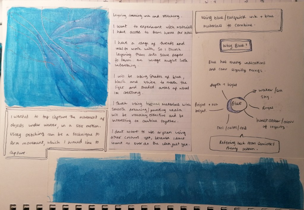
The idea for this experiment was going off of my aquarium images, with the colours and using a physical being or living material and other mediums.
I have always wanted to use a person or living body for some sort of development within my artworks and practice. The idea of using a body involves you having to be a part of the work being created, and i think the involvement whether it be between the artist and artwork or the audience and artwork, is interesting to see the interaction between them and the Reponses. But also using a person gives off the idea that the persons is also then, a part of the final artwork piece itself.
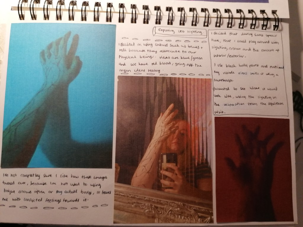
I dont often use bright colours through my practice, but i has been a target to at least try using it in my development and experimentation somewhere.
I think, that the process of these images where I have painted the outlining of my own veins on top of my skin, exposing the patterns was quite interesting. However, i feel that if i were to use another person, i would find that more interesting and accurate, because painting on myself was hard to keep my posture steady. However, because I’m quite pale toned, it was interesting for me to be able to study my body more.
However, for now I don’t think that I will be using LED lighting and the physical body at the moment. And because of the uncertainty of covid, it will prove to be difficult to have the right space and possibly to have a model of some kind to help with my study of the human body and mapping these sorts of features.
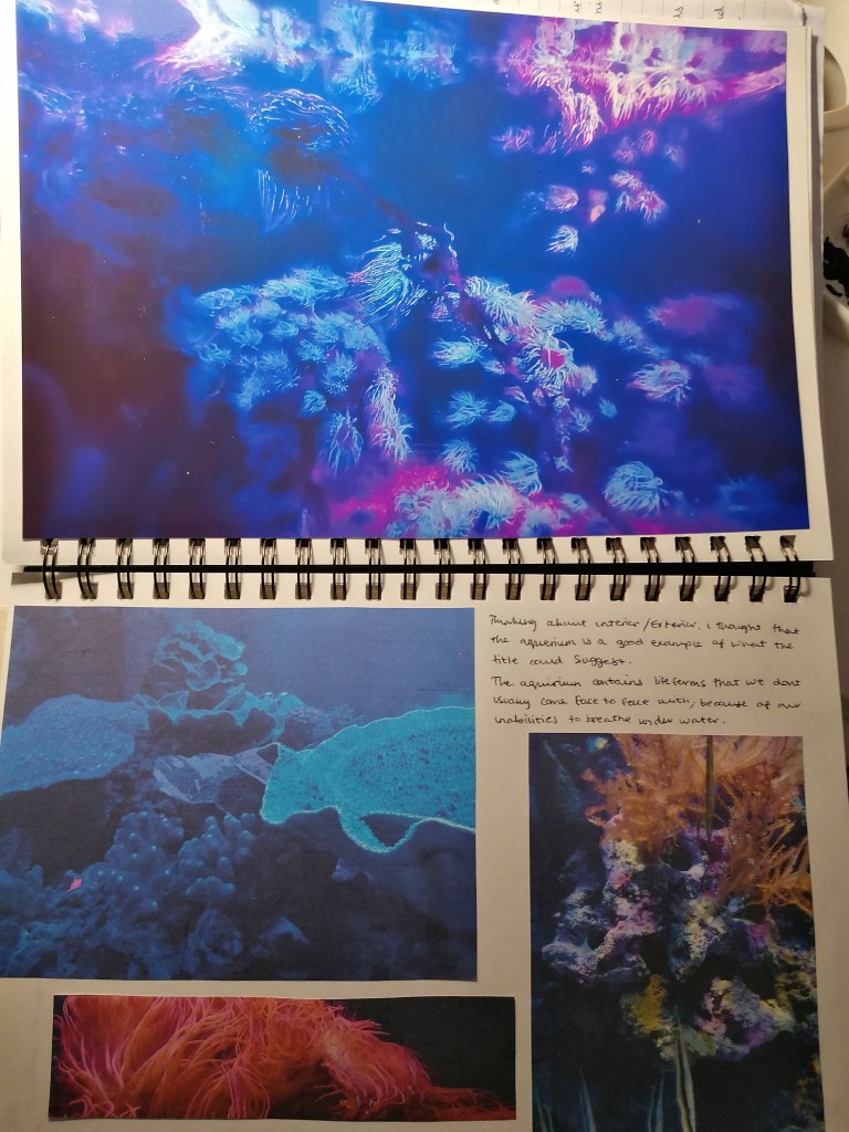
These pages of my sketchbook consisted of my visit to London’s Aquarium last year. Due to the pandemic situation, most small galleries were shut for the time being in Nottingham, so I took advantage of my trip to London to try gather what I could in terms for research development.
Using the title ‘interior/Exterior’ is what I found to be a very suitable title at the time of this visit. Because the aquarium does exactly what the title entails. It brings what we can’t usually see ourselves in it’s own environment to the surface, so we can witness it’s being.
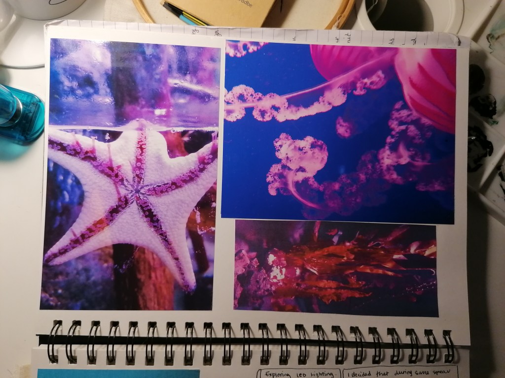
I decided to add these images into my sketchbook because i thought there was potential for the images to be used to further my project in ways of possible material uses and theme ideas.
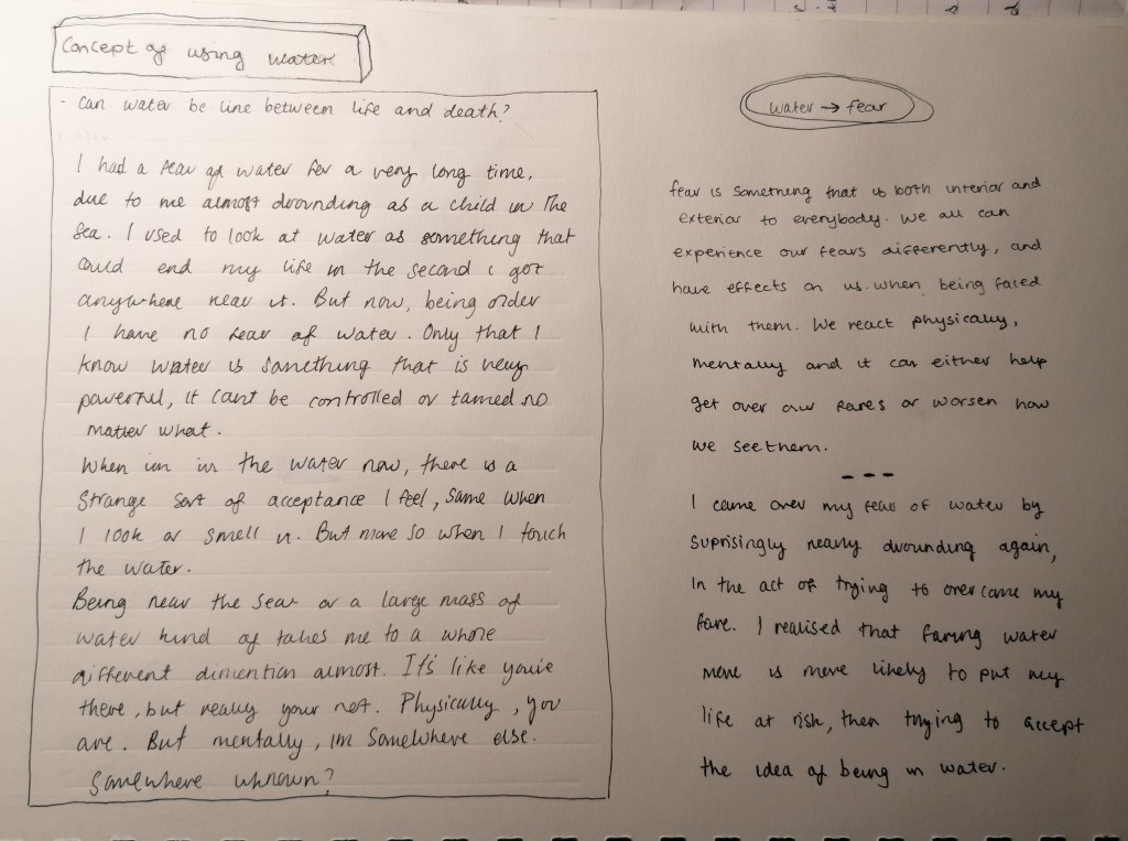
Which lead me to think about the possibility to morph both organs and water together and progress with my experimental development.
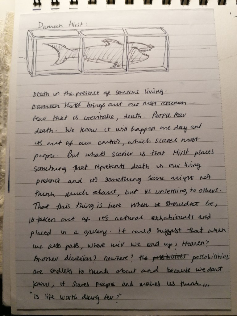
These are some artist examples who developed artworks using things such as organs and the human body as their main material use.
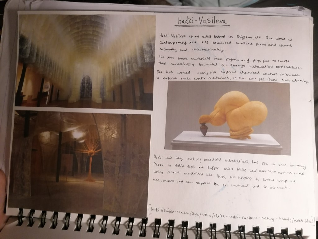
The artist is called Hadzi-Vasileva, she is based in the UK. She is an artist that has worked alongside medical chemical scientist developers to create sustainable materials out of animal organs and animal fats as a successful way to reduce waste and being able to experiments with different skill, techniques and explore material uses.
the top left art installation is called ‘Fragility’ which was installed in Fabrica Gallery. For this exhibition commission, she used pigs caul fat, exploring the idea of near death experience. Juxtaposing the experience and materiality.
The bottom left artwork is titled ‘Haruspex’.
The artwork on the right side is part of the exhibition, ‘Exposing Beauty’. it is made of a sheep stomach, lamb intestine and turned wood.
What I love about Hadzi-Vasileva’s work, is that she takes something that most people are disgusted by and completely transforms it into something that is beautifully presented and installed. Here installation pieces are one one my favourites because not only has she gone beyond with her material choices, but she transforms her exhibition space into something that brings out a curiosity and fragility in people.
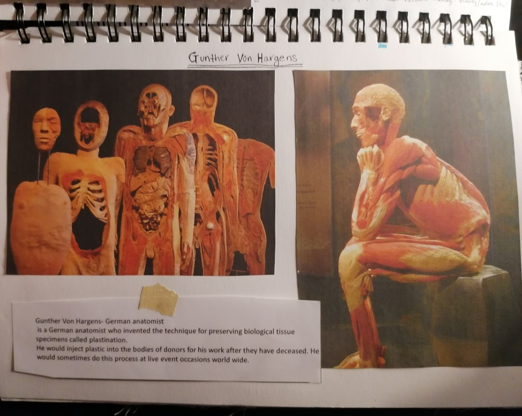
The second example is Gunther Von Hargens who is a German anatomist.
He uses the technique of patination to preserve biological tissue of the human body. What struck me about Hargens work, is that his collections of the body forms remind me of Leonardo Da Vinci’s anatomy sketches in an ink the is similar to to colour of these pieces.
Not only that, but the fact that these forms were those of what used to be living people at one point. And he has then been able to turn them into pieces of sculptor, which is objectifying. Though the people he used had already passed, were awear of what would happen because they donated their bodies to Gunther. So the idea of the whole transaction between their bodies to me is very strange and almost surreal that people would agree to something like that.
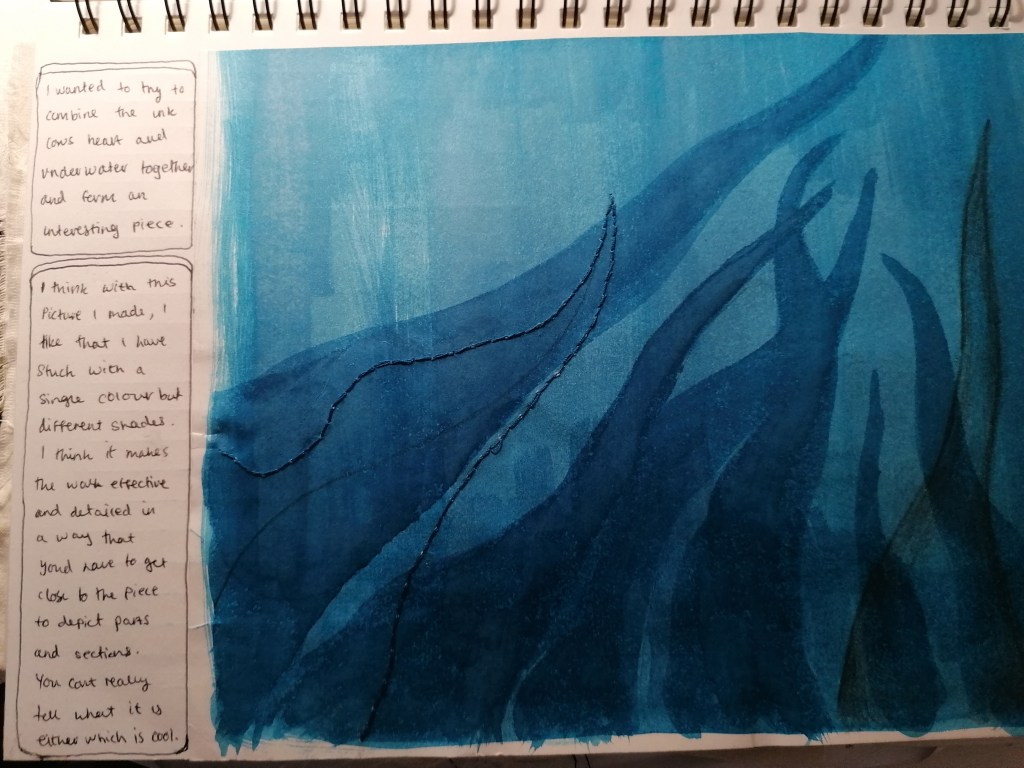
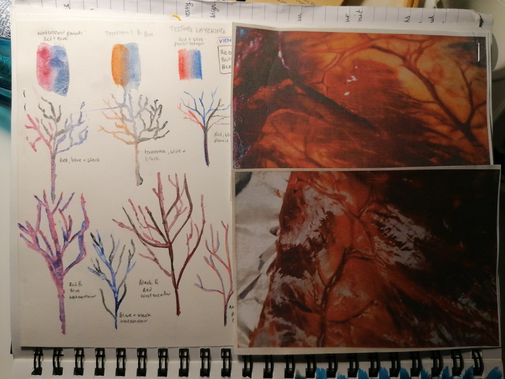
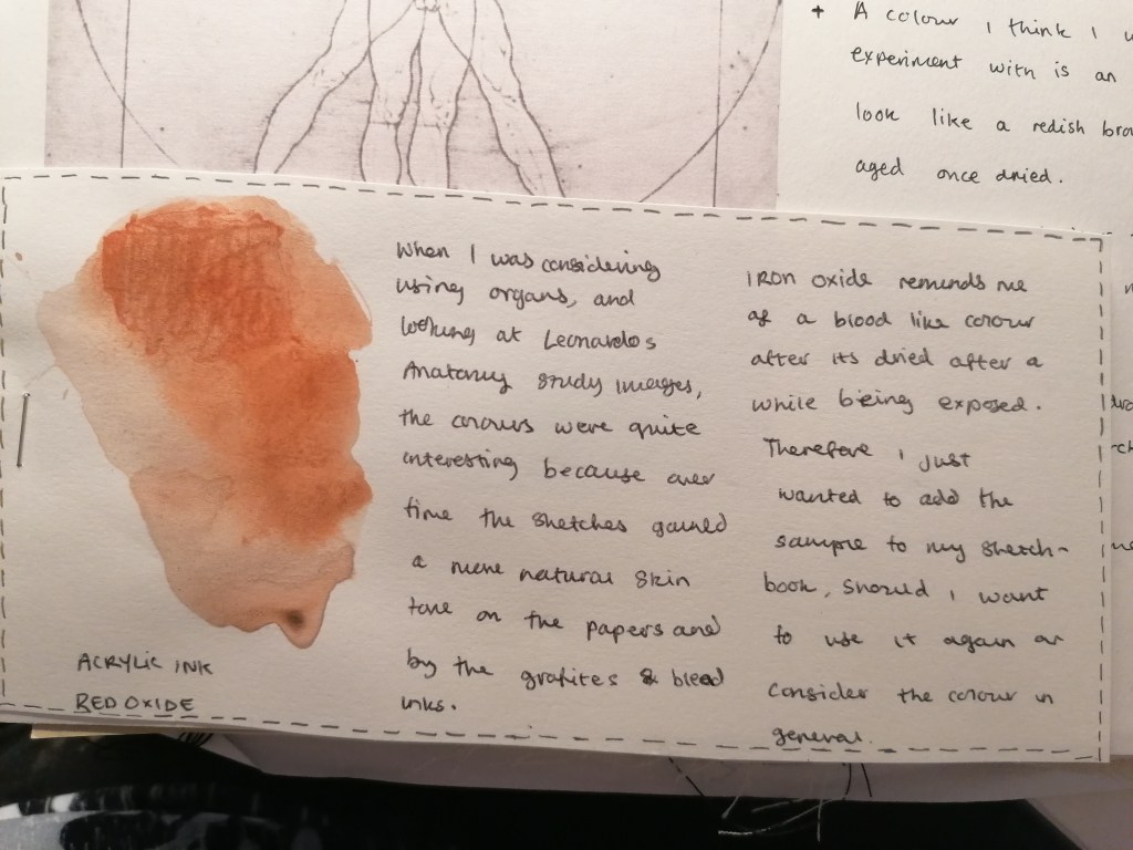
These sketchbook pages show the images from my past project, using the heart organ of a cow and my attempt to use watercolour to paint out vein like shapes. I thought that the organ experimental work was really interesting from my last project and it got me more curious to explore it a little further.
For these pages however, I wanted to look more into the colours of things. I think that the imagery of the experimental pieces with the organs are more effective than my attempt with the watercolour. My brush strokes are too thick and heavy to interpret as veins, and I think that the colours should resemble more realistic for the drawings to look effective.
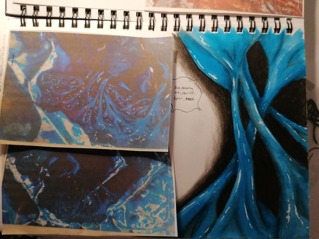
Experimenting with watercolour layering and past cow organ images for studyingTurquoise ink, charcoal and chalk
I think that using the ink and drawing materials are more effective for the study of the cows heart. I also think that because of the particular colour, that adds to the detail without much effort and it was enjoyable to add the highlighted and shaded areas on top of the bold colour itself. I managed to make the image seem almost 3D on paper, and I think that’s what makes this experimental study draw interesting. Especially because I was able to capture the textures of the real thing and be able to draw it out onto paper.
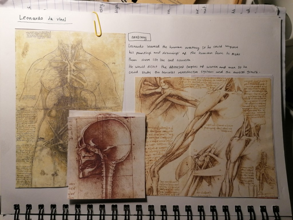
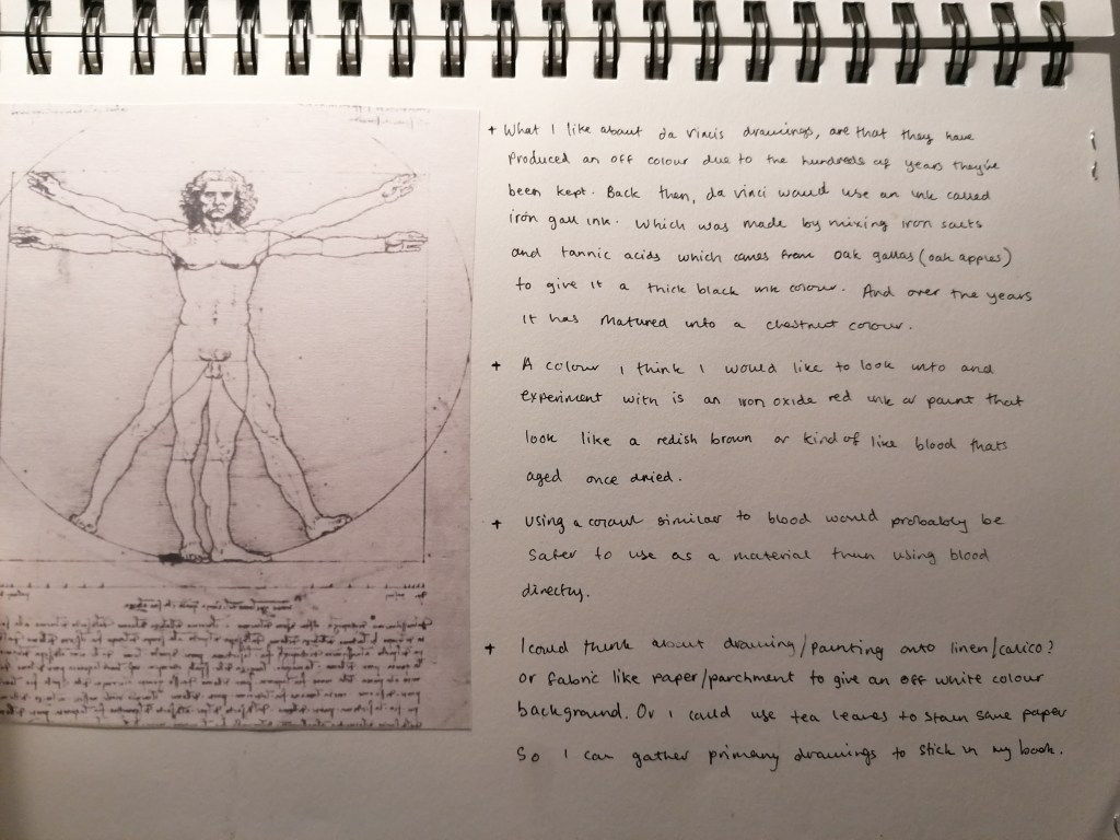
Thinking about interior/Exterior and possibly using the human body in this project, I thought that using Leonardo Da Vici would be a good artist example of someone who worked and studies the human body. Da Vinci studies the human body and drew these amazing study images on parchment paper and calico canvas. I like the colours of his illustrations, they are an off white background with drawing medium that i think almost resembles dry blood, which works well with the body drawings.